

How we design apps
From a task to a considered screen.
We design what people need to see, how they take the next step and what happens if something goes wrong. Follow four steps through an example from your sector.
Step 1 · Brief
First, understand the task.
We identify the task, the people using the app and the risks. That helps us decide what belongs on the screen and what would only distract.
Send money and be sure it reaches the right person, for the right amount.
Step 2 · References
See how other apps solve it.
We compare real screens for similar flows in the Mobbin library. We choose patterns that fit your task and test them in the context of your product.
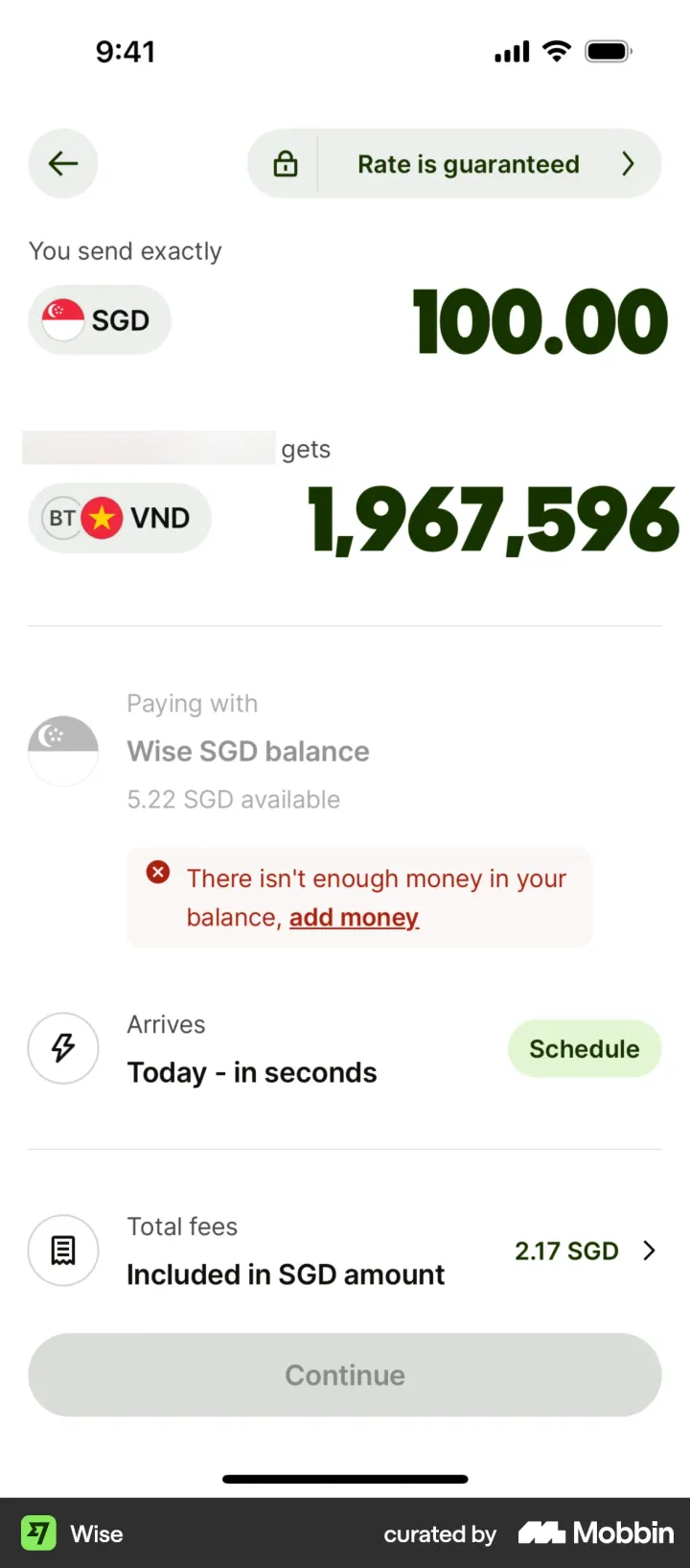 WiseAmount, fees and arrival time on one screen.View reference ↗
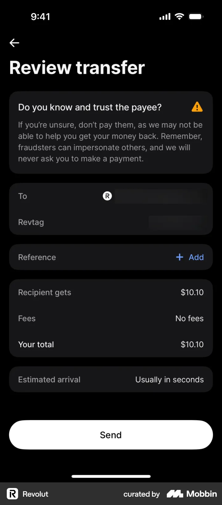 RevolutAsks whether you know and trust the payee.View reference ↗
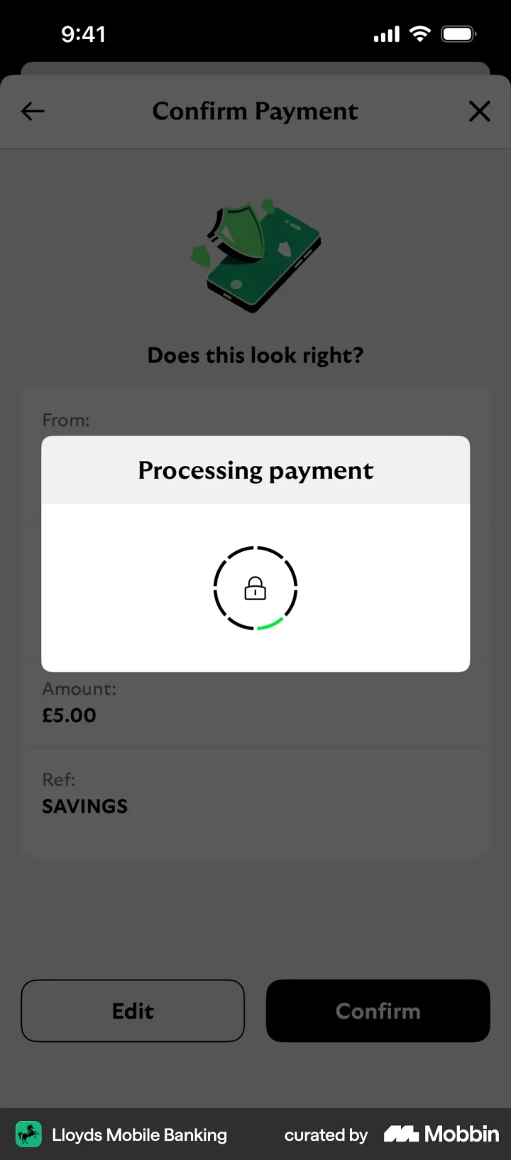 Lloyds“Does this look right?” with Edit and Confirm.View reference ↗
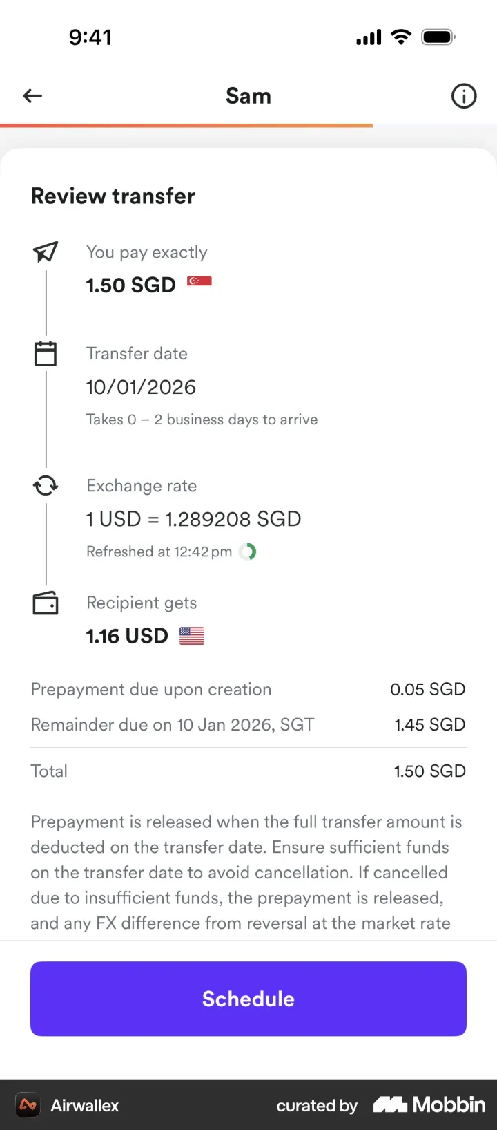 AirwallexExchange rate and arrival date spelled out.View reference ↗
References from the Mobbin library: screens from public iOS apps. Names and trademarks belong to their owners. These apps are not Tolaron clients.
Step 3 · Design
Every element has a reason.
Switch elements on to see what each adds. Accessibility notes illustrate dimensions and contrast. Testing the finished app also includes larger text and screen readers.
Without it, a first payment to a scammer looks like any other payment.
What we consider in the design
- Touch areas: platform guidance recommends at least 44 × 44 points on iOS and 48 × 48 dp on Android.
- Readable text: contrast of at least 4.5:1, or 3:1 for large text, under WCAG 2.2 AA.
- Larger type: the interface needs to handle changes in text size.
- Assistive technology: clear labels and a logical reading order for screen readers.
- Error recovery: explain the problem and offer a next step.
Step 4 · Context
Your brand. Including when things go wrong.
Compare the two designs, open the reasons for each change and try the error state. Change the colours to see how the same structure can carry another brand.
Amount and recipient sit at the top so they are easy to check before confirming.
At the starting point: buried in a formReferences: Wise, Airwallex
A first payment to a new account gets a reminder to check the recipient, giving people a chance to reconsider the transfer.
At the starting point: no checkReferences: Revolut
Fee, what the recipient gets and the total, spelled out. Nothing new appears after the tap.
At the starting point: “Fees may apply.”References: Wise, Revolut, Airwallex
“Today, in seconds” answers the next question before anyone asks it.
At the starting point: not mentionedReferences: Wise, Revolut, Airwallex
One button at the bottom that says what it does. Face ID or a PIN, never biometrics as the only way.
At the starting point: “SUBMIT”, half way up the screenReferences: Wise, Revolut, Lloyds, Airwallex
Tolaron created both illustrative designs with made-up data. Colours other than Tolaron blue represent sample brands.
More examples · Fintech
The same approach, different tasks.
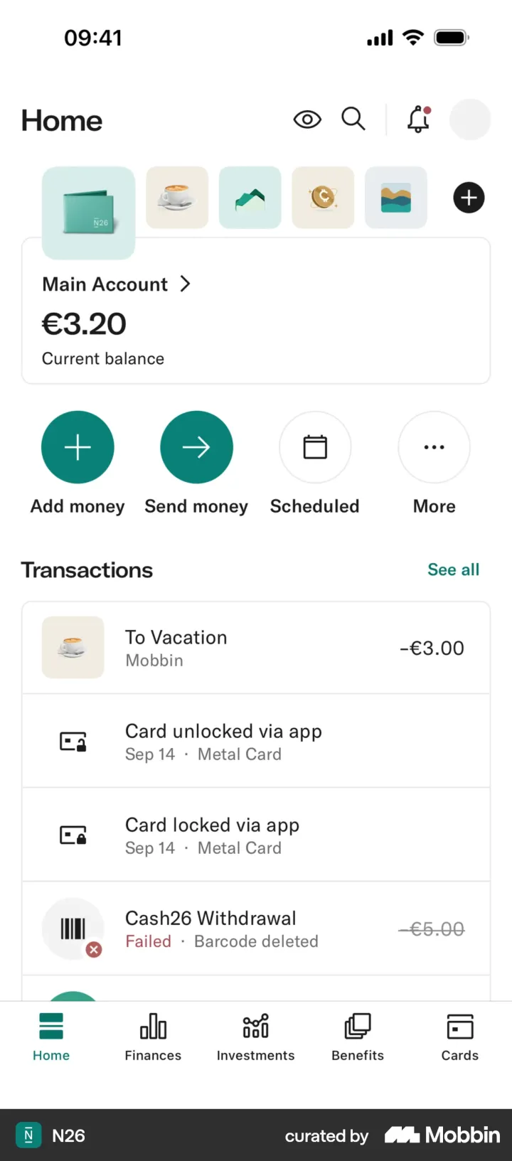
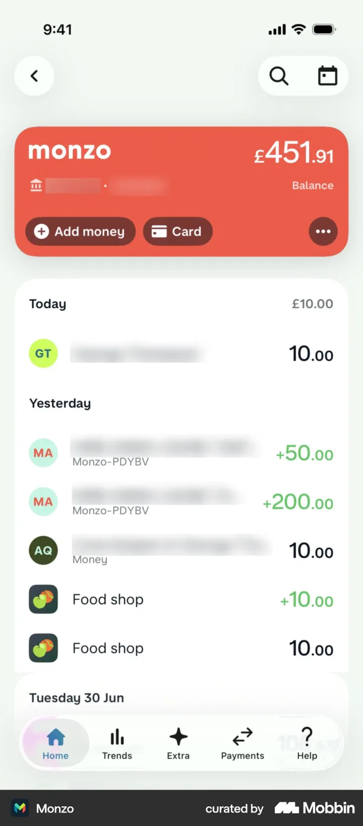
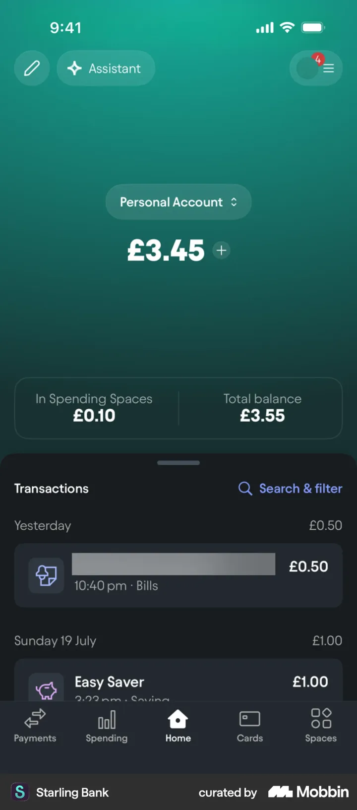
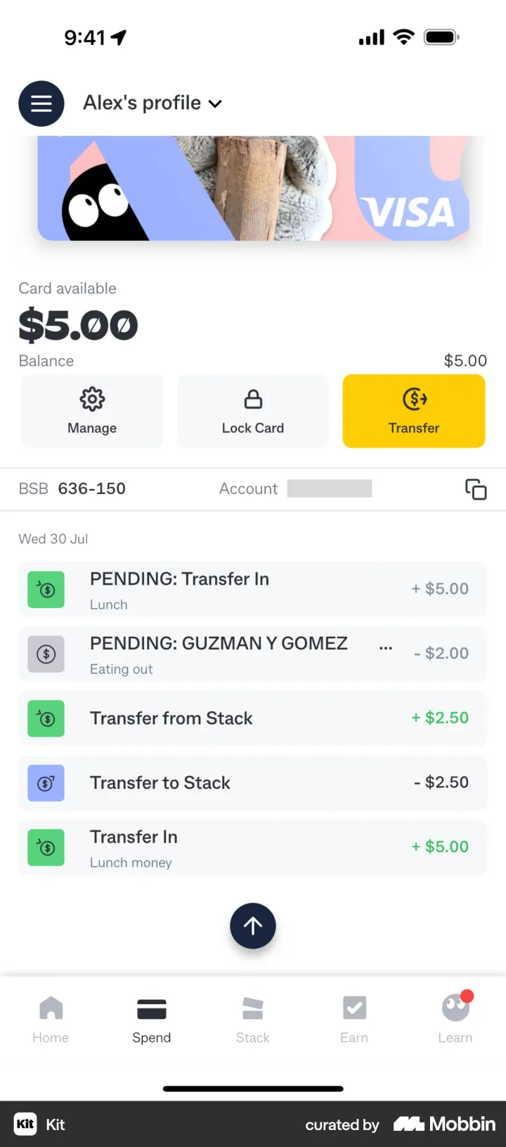
Home and balance
- The balance is the biggest thing on the screen.
- Two to four actions right under it.
- Transactions grouped by day, newest first.
What caught our attention: Starling shows the total across savings Spaces next to the everyday balance.
What this means for the design: home answers “how much do I have?” in one look, and the next action is one tap away.
References from the Mobbin library: screens from public iOS apps. Names and trademarks belong to their owners. These apps are not Tolaron clients.
What should your app make easier?
- We start with your brief: who will use the app, what they need to do and what it needs to connect to.
- References inform decisions: how to arrange information, when to show the price or where to offer help.
- We adapt the design to your product, brand and specific requirements. Verification is planned around the project’s risks.